


July has come and nearly gone with much variety of beauty and light.
Arizona gives us this every monsoon season. Capturing this beauty is always challenging.

July Insider’s Highlights

- Art Store Class & Workshop Reminders
- Getting the White Right by Robert Gamblin
- Shelf life of Golden Acrylics
- Saving Warped Watercolor Artwork
- Why does art framing cost so much? by Ida Kendall
- Horn Blow!
- Local Art Shows & Contests
Art Store Class & Workshop Reminders

Granite Mountain Monsoon
This August the Art Store is hosting a one-day intermediate oil painting workshop with Robert Knudson. With 55 years of painting experience, he can assist you with such hurdles in replicating what is important to the viewer when defining a successful painting. To see more details about this workshop feel free to visit our scheduler by clicking the images below.

Mountain Stream by Robert Knudson
This painting workshop is the second part of his previous introductory workshops with Bob. The previous introductory workshops are not required to attend this intermediate workshop. This workshop will be discussing and instructing the next steps in the evolution of a good painting:
- Understanding and managing better picture organization and composition, better freedom of ideas and creative planning and better
color and value choices are some of the subjects we will work with. - Getting past the frustrations.
- Thinking & planning more clearly.
- Moving beyond the doldrums and into a greater freedom of what and how you paint.
- A path to more exciting and successful results.
~~~~~~~~~~~~~~~~~~~~~~~~~~~~~~~~~~~~~~~~~~~~~~~~~~~~~~~~~~~~~~~~~~~~~~~~~~~~~~~~~~~~~~~~~~~~~~~~
Class Spotlight: Drawing II – Colored Pencil & Ink Techniques
Beginners to Intermediate
If you are just getting started or are in need of a review of what you may have already learned, this class is for you. Success in other art techniques are often dependent on how well you have learned to draw. Exploring the assorted techniques of colored pencils and ink pens. Expect to learn more than the basics about these materials.
Cost: During this month, the cost will be $100.00 (normally $115.00) for the first four Saturdays or $30 per individual session if class is already underway.
12 years and older.
**Mininum of 4 & a maximum of 8
To register, Call (928)443-0749 or register for this class online by navigating our class scheduler by clicking on the image to the right.
The required supply list can be found here.
Instructor: Keith Kendall, owner & manager of the Art Store
This class needs one more registered student to proceed
~~~~~~~~~~~~~~~~~~~~~~~~~~~~~~~~~~~~~~~~~~~~~~~~~~~~~~~~~~~~~~~~~~~~~~~~~~~~~~~~~~~~~~~~~~~~~~~~
For August the Art Store is also offering repeating classes in the following mediums:
 August’s Introductory Pastels – The afternoon class is a GO! For the morning class to be offered we need 0ne more student to register for the month. Single sessions are limited to one space until this time. Updates of this class will be posted as the registrations happen. If you wish to take this class but can only attend the morning sessions, you will have to register for the afternoon class and let us know of your preference. Any new students need to attend the first session of the afternoon class to see the demo by the instructor. After this point, you may change your attendance to the preferred time if there is space available. To register for this class as a new or returning student, feel free to contact us at the store or navigate our monthly scheduler by clicking the image at the left. Registration is closed after July 30th.

August’s Oil & Acrylic Painting Class – This class is a GO, contact Neil Orlowski @ 928-642-8018 for registration details and/or any class schedule changes. To view the details of this class feel free to navigate our monthly scheduler by clicking the image at the right.
 August’s Sculpture Open Sessions – These sessions are a GO! Register early to reserve your space for these single sessions. These sessions are built to be attended by students that wish to work with many of the different processes of sculpting. Multiple attended sessions are usually needed to complete your projects. To register for these sessions feel free to contact us at the Art Store. You can also navigate our our monthly scheduler by clicking the image at the left. Registration is accepted every week or weeks in advance.
Introductory Watercolor Class – This class is accepting registration until t he 6th of August. The present students are having a great time with our staff instructor, Sean Welch. They are loving the lessons and the absolute understanding of this medium. If you have had problems getting what you want out of watercolors in the past, this instructor can show you how to control this medium. Registration is accepted until the 5th of August.

Reminds us of some of the more risque work of the masters
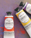
Art Store F.A.Q. – WHITEOUT!
There are common questions in the Art Store but mostly its about what each color is can or cannot do. White is not just white when it comes to paint. Robert Gamblin has organized his beliefs of what each white does in their line of paint. Robert makes it easy to understand and why you don’t want to use titanium white every time. Enjoy the article and know that the Art Store offers all these different whites. We believe its the easiest way to remember the basics and beyond.
Getting the White Right by Robert Gamblin
January 2012

Skip Whitcomb, Winter Pasture, Oil
The most important color choice we make is the white we bring to our work.
The white we choose determines to a great degree what our experience of painting will be: how our colors will tint and mix, how they will feel under the brush or knife, and how opaque our paint layers will be.
There are important differences between whites. For example, Titanium White has an opacity and tint strength that influences color like no other. Being the best-known white does not make Titanium White the right choice for every artist. You might prefer a white that’s more subtle in mixtures.
When I first started making color in my studio I began by making whites, there were three at the beginning. Over the last 30 years, we’ve expanded and refined our selection of whites. We now have seven to serve your needs across the spectrum of artistic possibilities.

From left: Titanium White, Radiant White, Titanium Zinc White, Quick Dry White, Flake White Replacement, FastMatte Titanium White, Zinc White.
This Studio Note is intended to help you select the right white for your work. And in Part Two of this Studio Note, we report the results from our on-going study comparing our whites with those of other American and European companies.
Part One: Getting the White Right
The right working properties for your artistic intentions
A good place to start in choosing your white is to think about the white you are currently using, why you chose it and how you might like it to feel and perform differently. Identify the working properties most important to you: is it the Texture or feel of the paint and its Mark-Making qualities? Dry Time? Tint Strength and Opacity? or Temperature?

Texture of Gamblin Flake White Replacement
Texture and Mark-making
This is both the most personal and the most important characteristic. For most painters, it is the feel and mark- making possibilities of their white that is most important to their work. Our whites range from soft and smooth under the brush, to buttery, to stiff and dense.
Our softest is Radiant White. Without modification, it is the most brushable – meaning it has the least amount of resistance under the brush or painting knife.
The buttery whites, Titanium White and Titanium Zinc, are in an ideal middle ground of texture. Straight from the tube, both have a “short” texture – meaning they break cleanly and quickly from the brush and make a beautiful, crisp impasto mark. Neither is too stiff under the brush or knife. And both can be nudged – with just a little medium – to be made softer. With just a little fluid medium, brushability is increased; the paint becomes softer and has more flow.
Our stiffest and densest white, Flake White Replacement, exerts a greater amount of resistance under the brush and palette knife. Flake White Replacement handles like lead white. This means it is “longer” in texture – with more pull, or drag, on the brush. This specific quality means it can easily replicate the impasto of a thickly painted Impressionist painting.
The texture of FastMatte Titanium White occupies a unique space. Its quick setup time means artists can add layers sooner and create broken marks without readily picking-up or mixing into the wet paint layer below. Out of the tube, FastMatte Titanium White will feel grittier and a little denser than our traditional Titanium White. The stiff and grittier texture allows for more broken mark making and defined brushwork – qualities prized by plein air painters.
Drying Rate
In general, whites made with linseed oil will dry faster than whites made with safflower, poppy or walnut oils.
For even faster drying, our specialty whites, Quick Dry White and FastMatte Titanium White, are formulated to dry considerably faster than traditional oil colors. Our FastMatte Titanium White dries in 24-hours. Its drying rate and matte surface make it ideal for underpainting. Quick Dry White retains the working properties of our traditional Titanium White, but will dry a day or two quicker.
For painters that wish to work wet into wet, or otherwise desire more open time without using mediums, we recommend using Radiant White. Radiant White is not modified in any way to be slow drying; it is just naturally the slowest drying white in our range, at about five days in thin layers.
FastMatte Titanium White: The New White
A number of years back we introduced a unique, mixed black called Chromatic Black – which painters dubbed with affection, “The New Black.” Our newest white, FastMatte Titanium White, similarly, has unique characteristics to rightly claim the title of the “The New White.”
 The FastMatte line of colors have the same intensity of color as our traditional oils and dry in 24-hours to the elegant, matte surface preferred by many painters. The matte surface gives colors a deep, soft luster and is ideal for grabbing subsequent paint layers.
Never before have oil painters been able to create a consistent, matte surface with such ease. The fast drying rate means painters can stay in the flow of their painting session longer with layering and mark-making possibilities beyond traditional oils. The consistent drying rate of FastMatte colors means painters can return to a dry surface the following day.
These qualities in the FastMatte Titanium White give it tremendous potential in a variety of painting techniques. The fast drying rate and matte surface make it ideally suited for underpainting techniques. Since all FastMatte colors are compatible with traditional oil colors, using FastMatte Titanium White as a primary white means that it will speed up the drying time of all subsequent color mixtures, based on the percentage used.
With Gamblin FastMatte Alkyd Oil Colors, oil painters can take their paintings further, faster than ever before.
Tint Strength and Opacity
If your goal is the same as the Impressionists: to simulate the light of the world whether it is landscape, still life, or portraiture, then opaque whites will support this direct painting style.
Titanium White and Radiant White do this better than any of the lead whites the Impressionists had to work with. Our opaque Titanium White and Radiant White carry higher loads of titanium and, in turn, reflect back 97% of the light that falls on them versus 93-95% for the lead whites included in our test.
On the other hand, highest tint strength and opacity are not for everyone. Renaissance style figurative painting, which strives to show the translucency of skin, is handled best by a more translucent white. Flake White Replacement, an exact copy of lead’s working properties, is most valuable for these sophisticated techniques. It can simulate the translucency of skin in a way that the more opaque whites can’t. Unlike lead whites, Flake White Replacement is non-toxic and can be disposed of without violating either local or national laws for the disposal of hazardous waste.

Claude Monet, Canotiers a Argenteuil, 1874, Oil on Canvas.
Zinc White is at the end of the spectrum of Tint Strength and Opacity. Zinc oxide is the only transparent white pigment. It can be used successfully as a white in glazes and scumbles where the glaze needs to modify light or atmosphere without “whiting out” what is below. Think of depicting the mist where the ocean meets the land, the transparency of a woman’s veil, or the flare of light coming off glass. Zinc White makes this easy to depict where titanium based whites makes this exceedingly difficult.
A note of advice concerning Zinc White: unless you are painting on a panel, Zinc White should not be used as the primary white in an oil painting. Further discussion of zinc below.

From left: Radiant White, Titanium White, Titanium Zinc White, Quick Dry White, FastMatte Titanium White, Flake White Replacement, Zinc White. Mixed with an equal amount of Ultramarine Blue, below.

Pierre Coupey, White Chair, oil on canvas
The Temperature of your White
Linseed oil whites are warmer; safflower oil whites are cooler in color. For most oil painters, the color temperature of the white, which is determined by the oil the white is made with, is not an important consideration.
But this will be an important consideration for artists who routinely paint passages of pure white. This is especially true for abstract artists who use white as a color and not as the light within a painting.
Upon aging

Leonardo Da Vinci, Saint John the Baptist, 1513 – 1516. Oil on wood.
, safflower oil whites hold their color the best: for abstract artists this also means that all colors mixed with safflower whites will also hold their original color the best. If this describes you, we
have Titanium Zinc and Radiant Whites for you to choose from.
A Great Place to Start: Titanium Zinc White
If I had to suggest a single white to consider for all-around use, it would be our Titanium Zinc White. This is my current favorite. Expressing color is primary for me and Titanium Zinc White lets that come through. It has a beautiful neutral white color, and its tinting strength is not super high, so colors mixed into it are not overwhelmed by the power of the white. In addition to all this, it dries pretty close in time to linseed oil whites and dries flexible.
Gamblin Artists Colors White Selection Chart
| Color Name | Characteristics | Drying Rate | Binder | Tint-Strength & Opacity | Temperature | Texture & Mark-Marking |
|---|---|---|---|---|---|---|
| Titanium White | Highest tinting strength | Fast | Linseed Oil | 10 | Warm | Buttery |
| Radiant White | The brightest, whitest oil color | Slowest | Safflower Oil | 10 | Neutral | Soft |
| Titanium Zinc White | Similar to Titanium White’s texture, more subtle in tint strength | Moderate | Safflower Oil | 7 | Neutral | Buttery |
| Quick Dry White | Faster drying traditional binder, not matte | Faster | Linseed Oil | 7 | Warm | Buttery |
| Flake White Replacement | Same working properties of traditional Flake White but does not contain lead | Fast | Linseed Oil | 6 | Warm | Stiff and Dense |
| FastMatte Titanium White | Thin layers dry in 24 hours to a matte surface with a beautiful tooth. Ideal for underpainting. | Fastest | Linseed Oil, Alkyd Resin | 6 | Neutral | Stiff |
| Zinc White | Transparent white. Best for use in glazes and scumbles. | Slow | Linseed Oil | 2 | Warm | Soft |
Please note that this is a relative scale, made to compare characteristics such as drying rate, opacity and tinting strength only in relation to the whites listed above.
Part Two: A Study of Whites
Synopsis after One Year
- Whites made with linseed oil are generally the most flexible, and whites made with safflower are the whitest whites. The white with the best balance between the two qualities is Gamblin Titanium Zinc White
- All oil paintings stored in the dark will lose a little brilliance and yellow to some degree, yet the color will recover when the painting is brought back into strong light
- Titanium White is superior to lead white in opacity and whiteness and equal in flexibility. Pigment loading has a greater effect on flexibility than choice of pigment
- Whites are at their whitest when used alone. The more medium that is added, the more their color will change. Binder changes color as it ages, not the pigments
- Zinc White is too brittle to be used as the primary white in a painting on flexible supports
Test Methods
Information in this report comes from results of a study conducted in our lab. Drawdowns of 5-mil thickness were made of 27 different white oil paints, from a range of leading European and American manufacturers, including all of the Gamblin whites. We included traditional oil colors and alkyd whites, and one paint that was a test formula Henry Levison devised and used in his tests on whites from his book “Artists’ Pigments, Lightfastness Tests and Ratings”, 1976, ColorLab.
Two sets of drawdowns were made from all paint samples. One set dried and aged in a room with natural daylight. The other set of drawdowns was left in the light to dry and then put in complete darkness for the entire year. Drawdowns of Gamblin whites were made from paint both straight from the tube and also mixed with Galkyd painting medium in order to test the effect mediums have on color and flexibility.
 Using our spectrophotometer the study samples were measured for color upon drying, at six months and at 12 months. After the tests at 12 months, the drawdowns that had been aged in the dark were put into direct, natural light for a period of time and measured again. The measurements taken at the end point of the study is included later in this report.
To test for flexibility a separate set of drawdowns was made and aged in natural daylight only. After a year, the flexibility tests were conducted using a Gardco Pentagon Bend Test tool. Drawdowns were determined to have passed the flexibility test if
they could be bent over a 1” mandrel without cracking. Additional drawdowns of each color were then tested further over smaller mandrels to find a fail point. Untested drawdowns were reserved for bend testing in coming years.
Common Questions from Painters and Findings
 Which are the whitest whites and what oil are they made with?
The flax plant has been the heart and soul of oil painting for 550 years. It has given us both the linen we paint on and the linseed oil we paint with. We know from this long and rich history that linseed oil dries the fastest, the hardest and is the most flexible among all drying oils.
All vegetable oils are made up of unsaturated fatty acids (linolenic, linoleic, oleic, etc.). Linseed is the only oil with a high percentage of linolenic acid. This material gives linseed oil its superior drying qualities. Linolenic acid also gives linseed oil its color. The yellow color of linseed oil precipitated to the use of alternative oils throughout the history of oil painting. At various times poppy and walnut oils were used. Now the preferred alternative to linseed is safflower, due to its pale color and consistent drying qualities.
Our study verified that safflower oil makes the whitest whites, whiter than poppy and walnut oil. Three of the four top results in terms of brightness were made with safflower. The fourth was our very lean Flake White Replacement based on linseed; this sample had very high brightness, but was not as neutral in color as the safflower whites. All of these four paints reflected back more than 97% of the light falling on them. All of them were titanium based whites. All of the lead based whites were far down the list in terms of light reflectance (Gamblin does not use lead in any paint formula).
The chart below summarizes the data from our test. It is organized according to the relative brightness (as measured by L*) of all the test samples.
Click here to download test results.
What whites are the most flexible?
The degree of flexibility of a painting is important because the more flexible it is, the more it will resist cracking in the decades and centuries to come as the painting ages and is subject to the stresses of moving, storage, changes in temperature and humidity. The flexibility of the white is therefore important to study since in the typical painting 50-90% of the paint on the surface is the white.
 With one exception, all of the study samples passed the flexibility test of bending over a 1” mandrel without cracking. The one exception was an expensive European paint based on linseed oil that had a very heavily loaded binder. As we progressed to tougher flexibility tests over increasingly smaller mandrels, the study samples made with safflower oil consistently cracked before the linseed oil samples. All of the drawdowns with 20% Galkyd added, showed greater flexibility than test samples without the addition of Galkyd. We will repeat this flexibility test in future years using extra drawdowns.
Concerning the European paint that failed the flexibility test, there simply was not enough oil to create a flexible paint film. Over-loading the binder is a way for a manufacturer to create stiffer whites. With this comes a price to pay in terms of permanence.
At Gamblin we work to strike a balance between some artists’ desire for the stiffest of whites and what we know to be a correct binder-to-pigment ratio. It is a myth that the stiffest of oil colors are somehow more traditional. Nothing could be further from the truth. True handmade paints from the Renaissance and the colors used by the Impressionists were both far softer than most any artist grade oil color available today.
If you are using some of the stiff paints described above you may consider also using a painting medium. The use of medium adds binder into the paint film and therefore increases flexibility.
How do Titanium Whites compare with Lead Whites (Cremnitz White)?
Throughout all of the tests, all of the titanium white samples were brighter and more neutral in color than all the lead white samples. After being aged for one year, the titanium white and lead white drawdowns were equal in flexibility.
For techniques where the artist wants a high degree of opacity, or to reflect back the maximum amount of light (Impressionism, or Plein-air painting) then titanium whites are best.
For techniques where the artist wants more translucency, such as classical portraiture to show the depth of skin, then Flake White Replacement or lead white are best.
As described above, there are great textual differences also. The titanium whites will be softer, or more buttery, the lead whites, and Flake White Replacement, will have the densest and heaviest of textures.
I have heard many times over the years from artists who use lead whites that they choose it because they believe it is less prone to cracking over time, with the implication being that titanium somehow is more prone to cracking. Our study to date shows this is simply not the case. Through my 25 years of work with conservators around the world, I can also tell you that the artist’s technique and supports, as well as a painting’s storage conditions, matter more to the health of the painting than precisely which white pigment was used.
Another important consideration when thinking about titanium whites vs lead whites is the toxicity of lead. If you wish more information on this subject concerning the health hazards you can refer to the Center for Disease Control’s Agency for Toxic Substances & Disease Registry.
Disposal of the lead waste from the painting process is also problematic. Throwing lead out with in the garbage, or burying it in your back yard, is prohibited by law. Lead paint, the tubes it came in, as well as rags and solvent used for cleaning when working with lead, are considered hazardous waste and have to be disposed of at hazardous waste sites.
In contrast, the pigment in our titanium whites, titanium dioxide, is widely used in toothpastes, as a food dye, and in sunscreens. Since our founding, we have been dedicated to making artists materials true to historic working properties, yet safer and more permanent. By our standards, whatever perceived or actual benefits there may be with lead white are far outweighed by the detrimental environmental impact and health hazard.
What is the role of zinc oxide in white oil paint?
The adding of zinc oxide to whites most likely began around 1850 shortly after it was invented. Adding zinc oxide to lead white significantly improved its working properties, taming the long, snotty texture of pure lead white. In addition, the texture of zinc makes Titanium Zinc whites softer under the brush or knife. In contemporary times it is easy to trace the making of titanium zinc white to the 1950’s when Henry Levinson used it in his oil color linePermanent Pigments. Levinson was a renowned paint chemist and found that a percentage of zinc oxide helped titanium whites to stay whiter:
“The yellowing of whites is popularly presumed to be a function solely of the oil. That is true with Zinc White and with Flake White, but not with whites containing titanium dioxide…In titanium whites zinc oxide can be a major factor in the reduction of yellowing and to some degree in aiding recovery from the loss of whiteness after being kept in the dark.”
Henry Levison, Artists’ pigments: Lightfastness tests and ratings, 1976
Zinc oxide, however, has its limitations – too much zinc makes for a brittle paint film. These issues have been studied in depth over the last 15 years by Marion Mecklenburg and Charlie Tumosa of the Smithsonian Center for Materials Research and Education. Mecklenburg was the first to warn that zinc oxide levels were getting too high in many brands of oil paint.
I visited Marion and Charlie in their lab at the Smithsonian in 2000 and discussed their research. Since then, we have followed their guideline to hold the zinc content below 15%. Zinc levels in our Titanium Zinc White are well below this 15% guideline. This percentage also happens to match well with the levels Henry Levison used in his studies.
Zinc White has important uses as the best white to create various forms of transparencies: such as in glazes or scumbles when there is a generous amount of medium to keep the structure flexible. As a general rule, we recommend not using Zinc White as the primary white in a painting unless working on panel.
How does exposure to light and dark effect the color of whites?
The colors in an oil painting are constantly changing, shifting slightly back and forth over a mid-line in response to changes in light on a daily basis. So it stands to reason that oil paintings change color when stored in the dark, and you may actually notice the changes. In the dark, paintings usually yellow or darken slightly, but then recover their color when brought back into the light.
The charts below, produced from our drawdown readings are typical of our overall test: the blue line was aged in the light, the red line aged in the dark. At the six month and 12 month readings, the samples aged in the dark were less bright than the samples aged in the light. Yet once exposed to direct daylight for a week, their color nearly reached the brightness of the samples that had been aged in the light the whole time.
We want to stress that most of this color change would not be noticeable in a painting since the whole painting reacts this way to light and dark storage conditions. The whole painting recovers its color when brought back into the light, not just the white oil color.
These charts are also examples of the higher brightness of paints made with titanium in comparison to lead: the Titanium Zinc White reached over 97% brightness and the lead only 95% brightness.

Correlation between this study and Henry Levison’s study
 The results from our study correlate closely with the findings of Henry Levison, whose published work is the most comprehensive writing on this topic. Henry Levison was the founder of Permanent Pigments, a company that started making oil colors in 1933. He then went on to create the first water based artist’s acrylic, Liquitex, in 1955. His book from 1976, Artists’ Pigments, Lightfastness Tests and Ratings included some of the questions we looked at in our study. Levinson used a yellowness index to report the findings of the aging films in the light, moving them into the dark, then back into the light.
Henry Levison’s published study can be found at:http://cool.conservation-us.org/coolaic/jaic/articles/jaic24-02-002.html.
We hope the information in this Studio Note is helpful to you in your work. If you have any questions, feel free to contact us.
The best part of our work is seeing the potential of our materials realized in your hands. We look forward to hearing from you and would be honored to work with you.

Robert Gamblin, Founder
To view more of Skip Whitcomb’s work, please visit: www.skipwhitcomb.com.
To view more of Pierre Coupey’s work, please visit: www.coupey.com.
**Artists’ work used by permission.
~~The Art Store now has a wide variety of 150oz tubes of their whites and colors in our big tube display~~
Where do you see art in your world?
 FALL FOR THE ARTS – 2016 JURIED ART SHOW
The Prescott Valley Art Guild is holding a Juried Art Competition from October 13th to November 21st, 2016. Entries must include a completed Entry Form, Entry Fee and 4″ x 6″ color photographs of no more than 2 original two dimensional works of art.
Entries must be mailed to Prescott Valley Art Guild, P.O. Box 26577, Prescott Valley, AZ 86312. Entries must be postmarked no later than September 16, 2016.
The show will be held at the Prescott Valley Library, 7401 E Civic Circle, Prescott Valley, AZ. Cash prizes will be awarded to Best of Show, 1st, 2nd, and 3rd place winners. All works juried into the show will remain on display in the Prescott Valley Library from October 13th to November 21st, 2016.
For additional information click here.
For a printable entry form and rules click here.
Shelf Life of GOLDEN Acrylics
It is important to keep the threads on the mouths of paint tubes, jars and bottles, as well as from the caps and lids clean,

Remove dried or wet paint from the threads of the jar and lid.
in order to maintain an airtight seal. Make sure to wipe the threads clean before replacing caps and storing paints. Acrylics dry through water evaporation, so if the water is kept in and the air out, it should keep the paint useable. Our jars are made of HDPE (High Density Polyethylene) plastic, which is a great moisture barrier and the liners in the lids also help to keep the products fresh.
If there is any separation of clear or milky fluid on top of the paints upon opening, simply stir the liquid back into the paint until you have a homogenous mixture. Do not pour off the liquid, these are important elements of the composition and should be mixed back into the paint.
If the paint or mediums have thickened, it may be possible to loosen them up by adding some GAC 100. Add in smal

For air tight closure, remove dried and wet paint from the inside and outside of the bottom and top of the cap.
l increments and stir until the consistency is similar to fresh paint or mediums. A little distilled water could also be added to help bring the paint back to its original consistency.

Polyethylene plastic sheeting circles cut to the diameter of the inside of containers.
If there is a need to store paints and mediums that have been thinned with water, we recommend using distilled water for the thinning, as tap water can sometimes cause mold growth. Acrylics thinned with a lot of water will often cause crashing of solids that cannot be remixed or overwhelm the preservative in the paint and also cause the paints to begin to smell and grow mold.
As the products are being used and the amount of paint, gels or pastes from the jars is being depleted, it may be possible that the large amount of air trapped inside or “head space” could cause the product to dry out. You could transfer the material into a smaller airtight container or the drying could be inhibited by using a circle cut from polyethylene plastic sheeting that is the diameter of the inside of

Polyethylene circles sitting on top of paint.
the jar and laying the circle directly down upon the paint, then closing the lid. This will reduce the “head space” and block oxygen from getting to the paint to dry it out. If the threads of the tube, bottle or jar seem very dirty and you cannot clean it completely, plumber’s Teflon tape could be used along the threads to help create an airtight seal.

Plumber’s pipe tape wrapped around jar threads.
If you have stored and cared for your materials properly and find any of the GOLDEN product has dried completely, please contact our Materials and Applications Department at 800-959-6543 or help@goldenpaints.com
Pokemon Go – PaintFound One! Pokemon G-Oil!
 Found One! Pokemon G-Oil!
Art Store Studio Tips & Tricks
Oh No! My watercolor is warped! It’s ruined!
That has been said by many beginning artists. If you made the popular mistake of starting a painting without the paper stretched properly, there is still a chance to save it. Many times the reason why it warped was due to the physics of the water being applied over some of the paper was allowing an uneven drying. What can you do now?
If you’ve already created your painting and the sheet is wavy after it has dried, there are a couple methods you can try to reduce the buckling. With both methods you’ll want to get the entire back of the sheet damp, and then let it dry at a uniform rate. Both methods use an approach that will not affect the front painted image. For each of the approaches below, if water soluble paint was used, extreme care must be taken to make sure the water used to soften the back of the paper doesn’t travel through the paper and dissolve the paint on the front side.
Approach A
 Mist the back of the paper with water using a fine mist.
  You can also use a damp sponge. Do not over wet. Cover with another sheet of newsprint, a towel or blotting paper. Place a board over the drying paper that is larger than the paper. Place drying paper down on a clean surface. The drying paper should be larger than the painted paper. Put weights on top (you can use books if you don’t have weights). Place the painting image-side down on the drying paper. Remove the board and weight every 2 hours and replace damp drying paper with new drying paper. Repeat this until the drying paper is not wrinkling or does not feel damp, usually around 4-6 cycles. Then put another new dry sheet of drying paper down and cover with the board and weight. Leave 24-72 hours until paper is completely dry.
Approach B
This approach is a more drastic solution that uses heat (an iron) with water to help relax the paper fibers. If you have never used an iron to relax the paper fibers before, a test should be done as this approach can ruin the paper if the iron is too hot or if it sits on the paper too long.
Mist the back of the warped paper with water using a fine mist.  You can also use a damp sponge. Do not over wet.
Place the drying paper down on a clean surface. The drying paper should be larger than the painted paper.
Place the painting image-side down on the drying paper.
Cover paper with a sheet of the drying paper or a towel.
 Using an iron set on medium low, gently rub over the entire surface. Adjust heat up as needed to allow the dampness on the back of the paper to relax the paper fibers.
Remove the towel or damp drying paper and replace with a fresh piece of drying paper over the painted paper.
Put weights on top (you can use books if you don’t have weights).
Remove the board and weight every 2 hours and replace the damp drying paper with a new sheet of drying paper. Repeat this until the drying paper is not wrinkling or does not feel damp, usually around 4-6 cycles. Then put another new dry sheet of new drying paper down and cover with the board and weight. Leave 24-72 hours until paper is completely dry.
Where do you see art in your world?
PFLAG PRESCOTT PRESENTS The 2016 PFLAG Prescott Art Contest is near its due date
Click the logo above to see more details about this contest.

BTS 2016 Promotion is coming soon!

Every fall semester, the Art Store offers their best deals on the art materials you need for the new semester and classes starting up. This promotion will be released as a spotlight in just a few days from now. Discounts will be up to 50% off the MSRP. Expect many departments to have the most popular items on sale for your local needs.
Black M/T Touch Sanded Paper is now in stock at the Art Store

Finally, a line of sanded papers that match the most popular Mi-Teintes colors! Featuring Canson’s finest-quality French paper at their core, these fine-tooth sanded, 218 lb (353 gsm) papers are destined to become your new favorite.
The surface of Mi-Teintes Touch is ideal for pastel, crayon, charcoal, colored pencil, silverpoint, stamping, and stenciling. It also works well with wet media such as ink, tube paints, and sprayed or airbrushed acrylics. Other wet media, such as oils and gouache, can be used alone or in mixed media applications that combine traditional and non-traditional dry media.
Why does picture framing cost so much? – Pt. 1 -A Frame & I Repost

This is the real deal, an original Andy Warhol artwork on fragile paper. The pop art frame fits it perfectly and has preserved the art for years to come. This art would never fit in a ready made frame, it’s an odd size. Tape and glue would damage it. And the thought of sending it to an online framer where it could be lost or damaged in shipping is a frightening proposition. Professional picture framers will frame it right!
Good question! Have you ever gone to a frame shop and been surprised by the cost of professional picture framing?

We framed this old violin with a picture of the musician in a custom faux leather clad frame. The violinist’s name is hand tooled into the bottom of the frame.
This is actually a pretty common reaction to hearing the cost of anything built by a professional to custom specs. It’s not only picture frames that can seem pricey… Think of handmade one-of-a kind furniture, tailored clothes, handmade shoes, fine art, tattoos, designer eyeglasses, hiring a chef for an evening… anything at all that requires a professional to help you do your project right! It can even be the plumber or the electrician, the cabinet maker or tile installer, the auto mechanic who puts superior brakes on your car, the waiter or waitress who delivers exceptional service, or any number of professions that are skilled and capable of doing the work for you beautifully. Do these things sometimes cost a bit more than off the shelf stuff? Sure, but they’re worth it!
That being said, picture framing is perceived as so expensive for many reasons. So let’s talk about value, which is really the operative word here! Value is a word that is synonymous with expensive, but the meanings are sometimes almost opposites. Where “expensive” typically means something priced above its actual worth, “value” means it’s worth what it’s priced. Picture framing is then a valuable thing to do, not an expensive thing to do – because when it’s done right it really does add value to the item that’s being framed. Sure, some throw-away items are not worth it. That’s what thumbtacks are for! A great frame not only preserves and protects its contents, it is a work of art in its own right. This awesomely designed work of framing art enhances and elevates the object it frames. We once heard it said that a frame is a halo on the art; we’ve also heard it said that “The frame is the reward of the artist.” -Degas. A good frame isn’t just a means to an end… hanging a picture is only a little part of what the frame does. Frames give a piece its character, its provenance, and help to tell the story of the art or object inside – all the while quietly serving and protecting the frame contents.
It takes a professional who’s been trained in the art of design, and the technical aspects of framing, to make a beautiful frame that protects its contents. These items aren’t just glued in! They’re usually attached by hand using the

We embossed the violinist’s name into the faux leather frame surface.
least invasive methods possible and the goal is to do no harm.
Let’s talk about picture

Uhhh.. yeah, I wouldn’t try framing this full size rug at home. And I definitely wouldn’t send it out to an online framer. Scale model is 5’3″, and usually a red head.
framers. Independent picture framers are a very unique group of artists and craftspeople who have a desire to help you display your treasures. They’re not out to get you, they’re not getting rich; but they are making a living! Now… Some of the issues that are important to framers are preservation, decoration, and engineering/technical aspects of how to hang something on the wall.
A good framer will discuss all of these elements with you and give you suggestions to really show off your frame-able item. They’re not going to automatically assume you want the cheapest option, because that isn’t always the best option! They’ll recommend glass that prevents fading of the mats and contents of the frame; they’ll show you a frame that’s the right size and color to really show off the items in the frame. What they’re after is the very best display for your items. That doesn’t mean it HAS to cost a lot though! If you let your framer know you’re working with a budget, they will do their best to show you selections and offer suggestions of ways to work with that budget. Many independent framers off

This campfire photo is really awesome! There is no way you’d find a frame that shows it off this well online. A white mat would just kill the beautiful colors. Professional framers can point you in the right direction!
er good quality, affordable framing options. Just ask them!

This pop art octopus silkscreen, made by a college student, is framed in a wide mat and a squiggly frame that playfully plays off the squiggly octopus arms. It looks fabulous!
A great framer is like a great hair stylist, really. They make you look SO good! Just like a great haircut compliments your face and showcases your style, a great frame compliments your frame-ables and shows off their best assets. You don’t want to trust it to just anyone. It’s important to shop around and get to know who’s who, especially in picture framing. You’d be amazed at the talent out there!
But let’s talk about something serious. Doing your own framing using ready mades or cheap internet services is kinda like giving yourself a haircut with regular hair clippers. It will be passable, and if you practice a few times it might even look really good… but at the end of the day at best it looks like everyone else’s home haircut. Some days, this is perfectly fine and for some folks, it is good enough. But we all know that if you want it to be really special you go to a pro. Or if it comes out really bad, the pro is there to fix it for you.

You mean to tell me these things come in colors? YES! You don’t have to get a plain white or black mat… frame shops have all these beautiful choices and more. Awesome picture framers will help you find the perfect color.
A professional framer is an artist (usually a humble one). They want to e

This grade school student work is made out of painted newspaper clippings. The framer made a newspaper collage of plain newspaper as a backdrop, cut a custom arch, and framed it with UV filtering glass. Masterpiece, am I right? The mom cried when she saw it. These are the moments worth framing, even though the art isn’t “expensive”.
nhance the object or art being framed. So the frames they help you choose will really look great and unique to the project! Why put a boring white mat on EVERYTHING you frame? Why only black or gold or white or brown? Yawnsville! We aren’t living in the 80’s anymore, so choose some frames that are really awesome and unique! Go to a real, local, independent framer and see what else there is out there. Talk to them. See what they suggest. A whole world of colors, textures, fabrics and papers is there for you.
It may take a little time to find a framer you love – but when you do they will love you back! You will never regret investing in the things you frame. People will be really impressed with your collection and your awesomely framed items will tell your story for you – just like the books on your shelf do… if you are one of those people who still has physical books, that is! 😉
Thanks for reading!
-Ida K.;p
2016 12″ x12″ Art SWOOP Call for ART

‘Tis is seeking donations of artwork for their annual “fun”raiser fundraiser benefiting the ‘Tis art education programs for children and adults. To find out more about this project, feel free to click on the image above.
It’s time to blow our own horn!

![]()
We donated 75 canvases to the Tis’ Art Swoop for their annual convergence of creative spirits program. Contact them to receive a free canvas for this fundraiser.
![]()
We donated 30 colored pencil sets to CCJ’s Fair Start Program
Local Artist Spotlight – Janimal Draws

Jan Marc, local political cartoonist has a wit that finds the humor in our troubling times. His art mixes popular culture with the present political atmosphere. As part of the local art community he teaches classes for Yavapai College as well as local workshops. To view more from this artist, click on the image above.
Support Your Local Stores or they will disappear
NY Central Art Supply VANISHING

NEW YORK, NY: Last year NAMTA (InterNational Art Material Trade Association) shared the news that New York
Central, one of the oldest art supply stores in the country, was in
trouble.
Today they announce that the shop will be going out of business
by end of summer. Doug Steinberg wrote in with a press release,
explaining that the closure is “due to poor business conditions
and its building being sold.”
From the press release:
“The store, which has been in continuous operation at 62 Third
Avenue since 1905, is losing its month to month lease at the end
of September.
Founded in 1905 by Benjamin Steinberg, the store has been run by the Steinberg family for more than 3 generations.
Benjamin’s son Harold (whose brother Gilbert went on to open Lee’s Art Shop which also recently closed) took over in
the 1940s. The store’s most recent President, Steven Steinberg, started working at the store in the 1950s and took over
in the early 1970s. He built the store into a mainstay of modern artists, and added a world‐renowned paper department.
His sister Marcia Norins worked there as well, running New York Central Framing, which closed in 2012. Steven Steinberg
recently passed away in November of 2015 after a lengthy battle with Parkinson’s Disease, and his sister Marcia passed
away from Cancer in July of 2015.
‘We’ve held on as long as we could out of loyalty to our long‐time staff and amazing customers, but the business was not
set up to survive current economic conditions,’ said Barrie Steinberg, Steven’s daughter.
The store’s customer list over the years has read like a who’s who of modern artists, including Andy Warhol, Willem
deKooning, Frank Stella, Larry Rivers, Cecily Brown, Keith Haring and many more, but in recent years the store has faced
tremendous challenges from the rise of online shopping and the infiltration of national chain stores.
‘In a world where people can get what they need shipped to their door with the tap of a finger, Central’s old‐world
charm and personal service was both a blessing and a curse,’ said Doug Steinberg, Steven’s son. ‘It’s very emotional for
everyone. I’ve known most of the employees since I was a boy. I really hope another store realizes how amazing they are
and offers them a new opportunity.’
The store plans on remaining open throughout the summer as it liquidates current inventory.”
Amazon just released that they will be removing the MSRP (manufacturer suggested retail price) or list price from about 30% of their products due to the present offered prices being less than 1% in difference plus shipping & handling and/or even higher than the MSRP. I have known about this practice of the online retailers perceiving their value for years by abusing the belief of lower prices online. Not everything online is worth purchasing that way. You need this “list” or “msrp” for a constant to compare the overall pricing on such items. Buyer Beware!
Don’t forget that the Art Store has a webstore with up to 45% off some items that you can choose to pickup your art materials in a short time (if already in-stock). Most orders are delivered in under 8 days to the store. With every sale you will be notified of the out of stock items and their estimated delivery time. Just choose the “pick it up in-store” option at the end of the purchase. Support the locals and they support you! – Keith K., owner & manager

The Frame & I Spotlight

A beautiful monochromatic painting in an elegant maple float frame from The Frame and I.
![]()
In the Mezzanine Gallery
“David and Tony Are In the Mezzanine!”
Paintings by David Van Gorder and Turned Wood Creations by Antonio Leal

July 15 – August 14
Artist reception Friday, July 22 from 5 – 8:00 PM
Tony is a retired career Army guy with a great sense of humor and a sincere desire to share his craft. He likes to say that the ultimate compliment from someone viewing his work is when they ask: “How did you do THAT?”
As for David, he too, has a keen sense of humor and also has quite the story to tell. His website describes his life and philosophy best: www.vangorderartaz.com
“It’s not what happens to you…it’s what you do about it that makes all the difference.” – David Van Gorder
